
UMA Brand Guidelines
The UMA brand has been designed to be simple, so it naturally fits into your product. The guidelines below outline the standards for the use of UMA's product and branding elements. They’re here to help ensure a consistent, trustworthy and professional experience for customers using UMA in your product.
Please take the time to review and apply these guidelines to any product, materials, or communications related to UMA. We appreciate your commitment to upholding the UMA brand identity.
UMA Logo
The UMA logo is central to the brand as it will be identified universally across a variety of platforms and other brands. It is critical it keeps its integrity at all times to ensure trust for all users.
To download the logo files and additional UMA visual assets, click here.
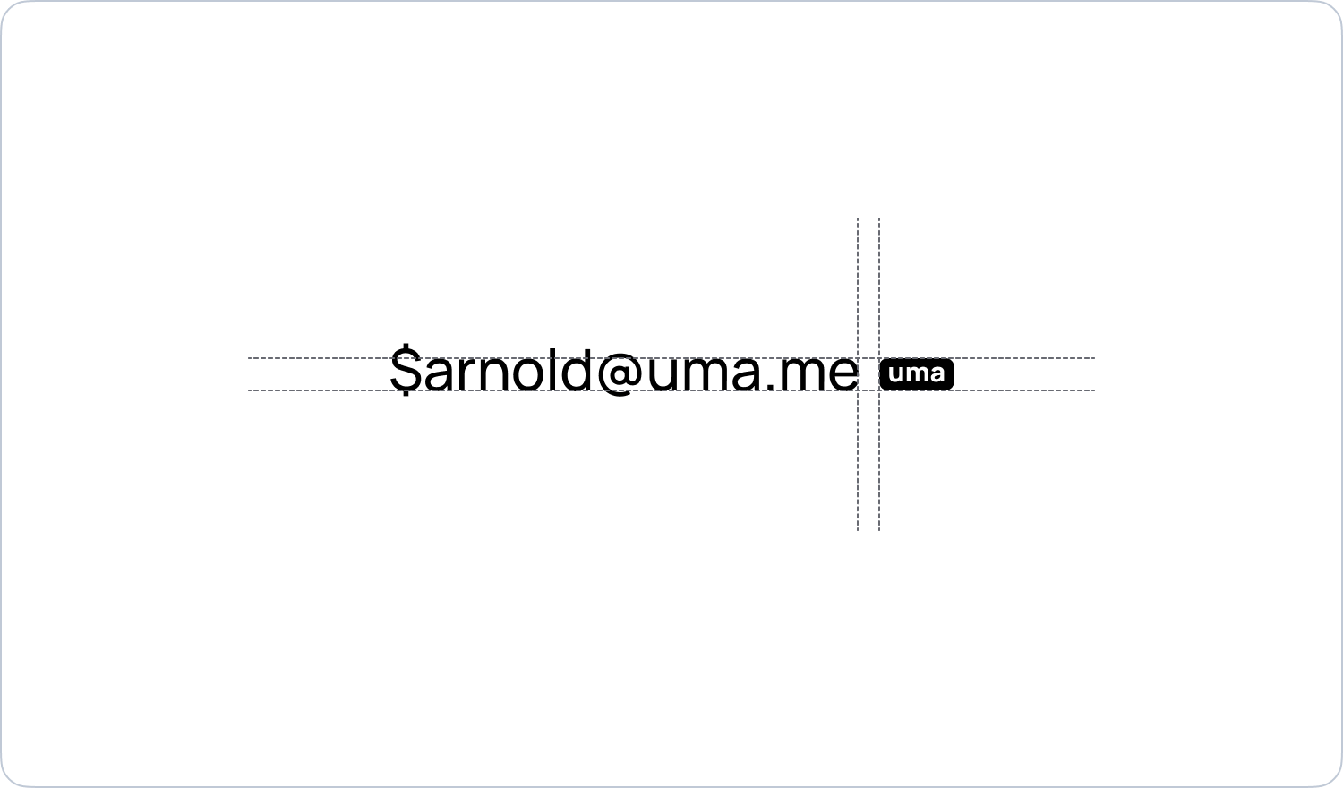
Safe space
The vertical height of the UMA logo can be used to determine the safe space around all four sides. This is generally a good rule in the product too, but there are instances where it makes sense to place the UMA logo closer to an element.
There may be instances where you want to closely associate the UMA logo with its address. In this case, you can reduce the padding to better make the complete address look like one element.
Minimum size
The UMA logo was designed to scale down to very small sizes. This allows for it to be placed in fields and still be legible. While it can go smaller, we recommend a minimum size of 12px in height.
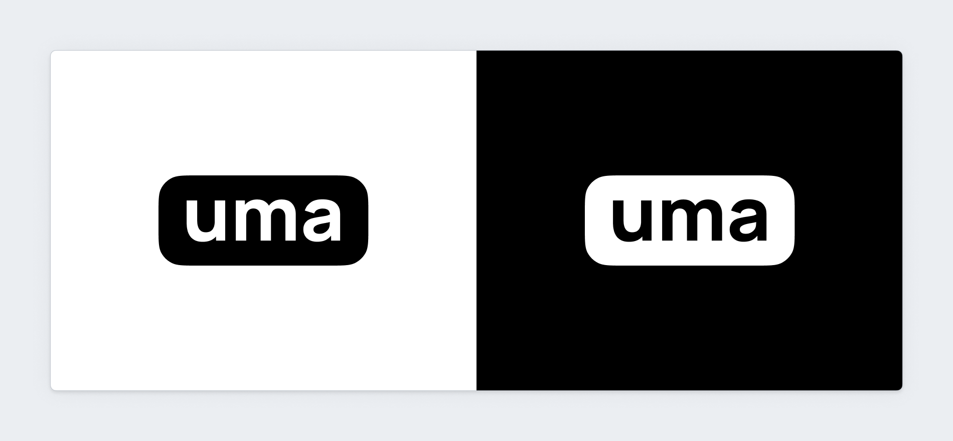
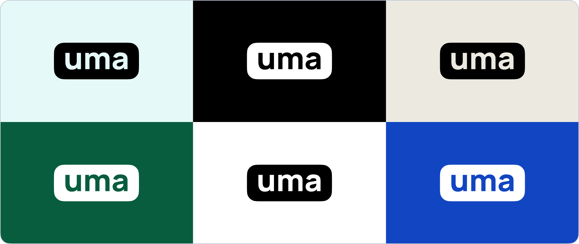
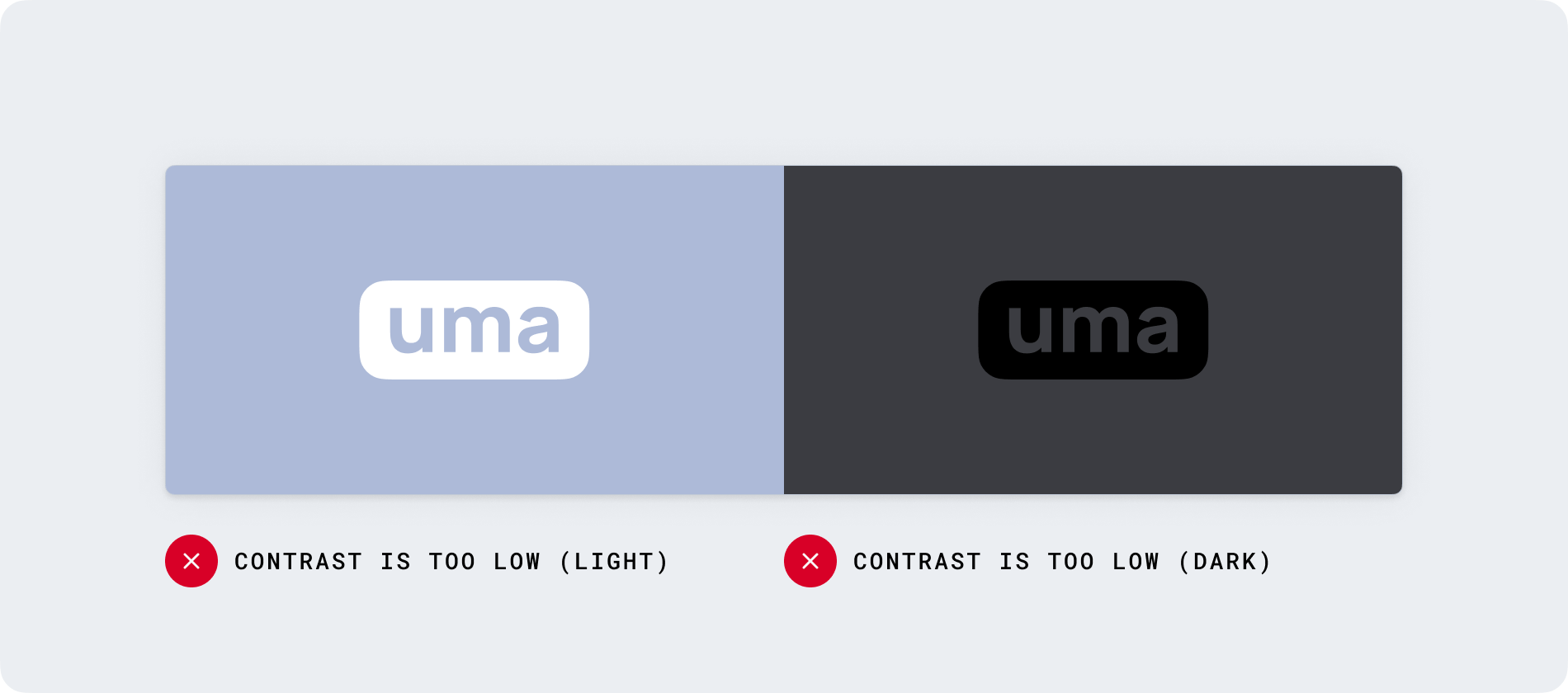
Contrast
To maintain legibility, always place the UMA logo on high contrast backgrounds. This is especially important since the UMA logo is typically displayed at small sizes.
Works with UMA
When using the UMA brand alongside your own, we recommend using a horizontal lockup below your own logo, smaller in scale to show the relationship of integration into your products and services.

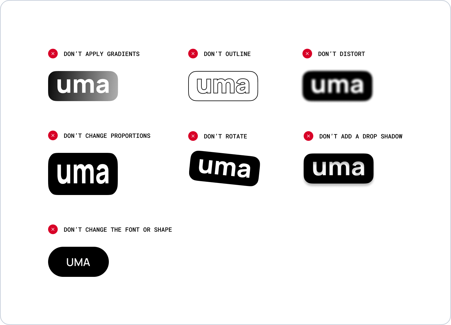
Logo uses
Don’t manipulate the logo in any way. Below are some examples to avoid.
UMA fields and validation
The guidelines below cover entering and displaying a Universal Money Address.
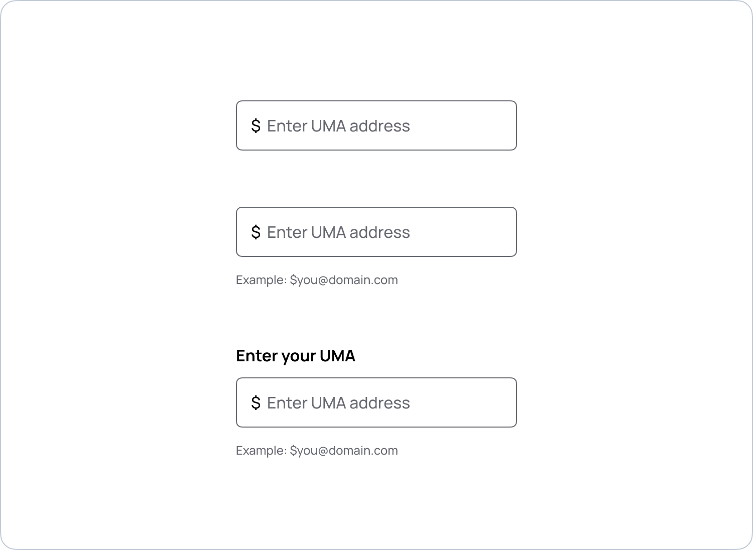
UMA in form fields
Leverage existing form components from your design system for consistency in your product. Below are examples of how you might integrate examples when asking for an UMA.
All UMAs begin with a ‘$’ symbol. Strive to make user experience as easy as possible (reduce cognitive load) whenever a customer is trying to send to an UMA. For example, using typeahead functionality to complete an address when it is known. Ultimately, this is up to you to make the best customer experience possible in your product. Here are some suggestions to consider.
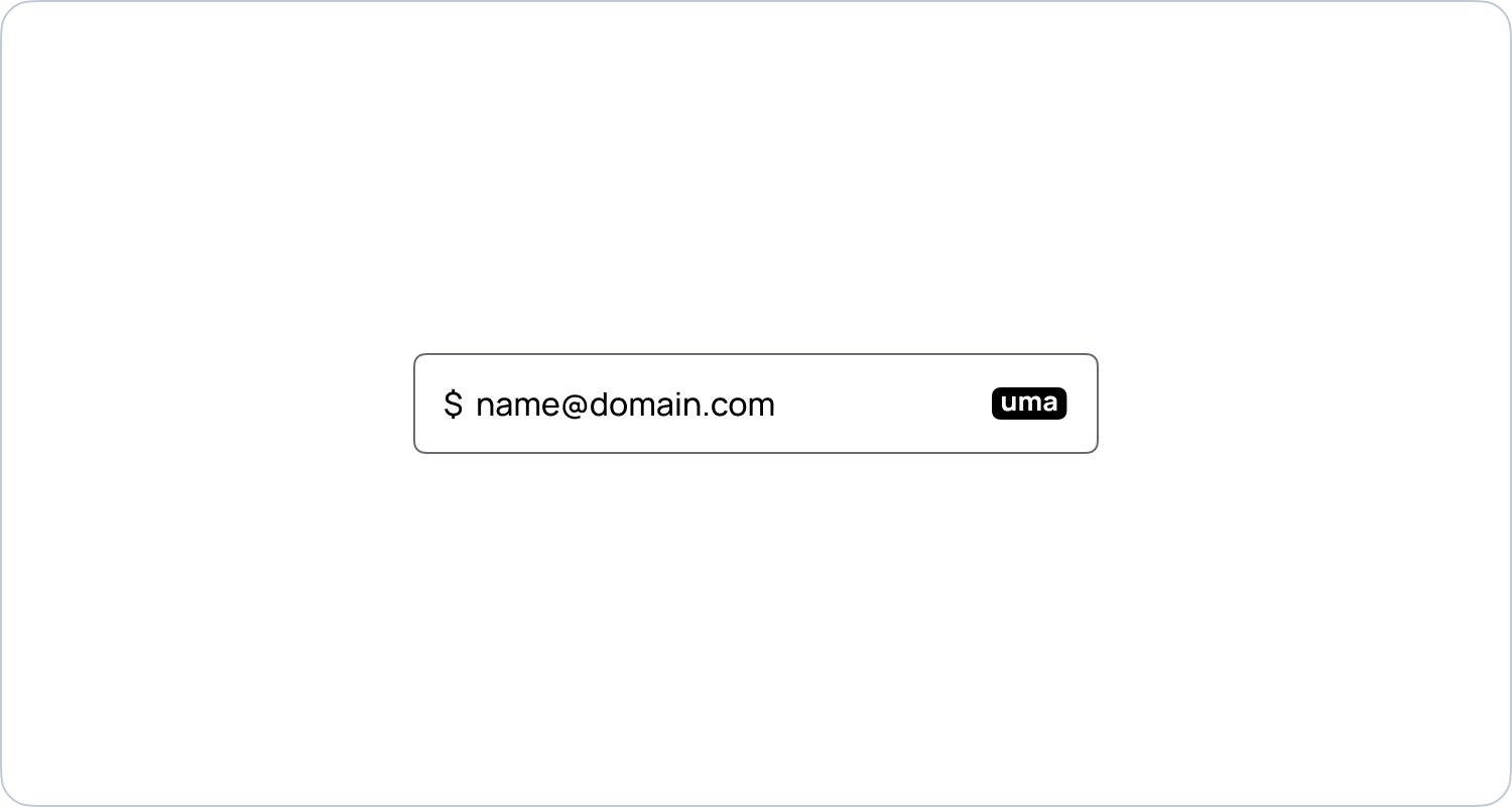
UMA only input
We recommend having the ‘$’ symbol built into the input field by default to remove the need to type the symbol.
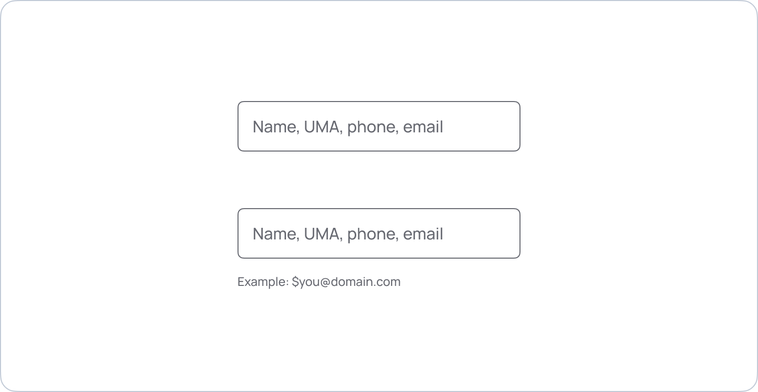
Multi-type input
UMA is also meant to live alongside other types of addresses, like a wallet address, phone number, email, or contact. Help customers use UMA in places like placeholder text, and input help text on screens where a customer is inputting a recipient to a transaction.
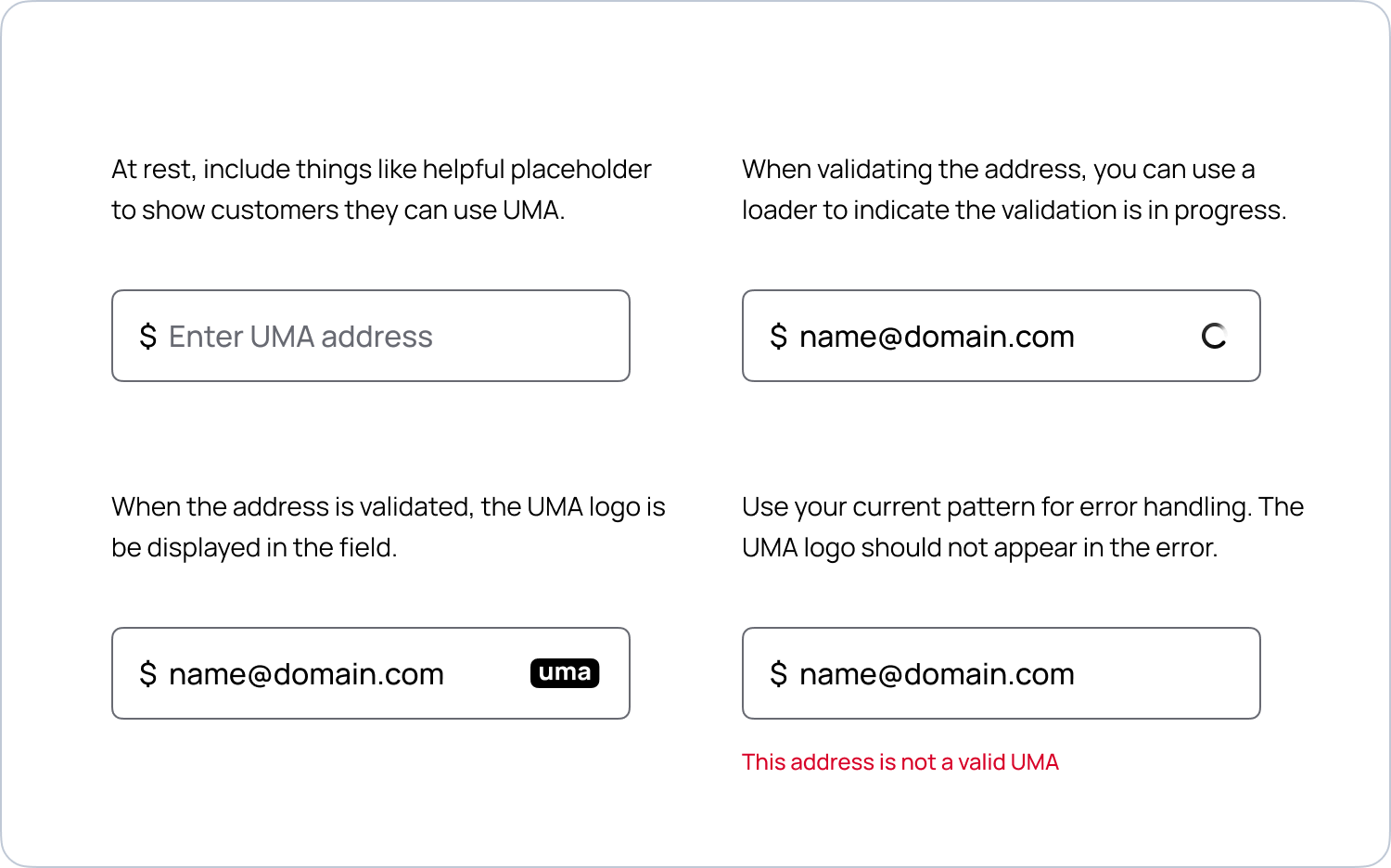
Form validation
The below illustrates the various stages of entering and validating an UMA. Below is one possible way to place the UMA logo in the vicinity of the form field when the address has been verified.
Position and scale
The UMA logo is designed to scale down to small sizes and still be readable. Below you’ll see some sizing, position and padding recommendations.
Once validated, the UMA logo is best placed on the right of the form field (except for RTL languages, in which case it’s positioned on the left).
Because it’s important to leverage your existing form field design, there are no hard rules for scale and placement of the UMA logo in the validated form field. Here are a few guidelines to consider when adjusting your existing fields to accommodate for UMA.
- It should be small, but legible enough to read. If it’s too big, it overwhelms the field and takes up too much character space for the actual input.
- Align it to the right when it makes sense with appropriate padding around it. This will change based on the size and shape of your fields.
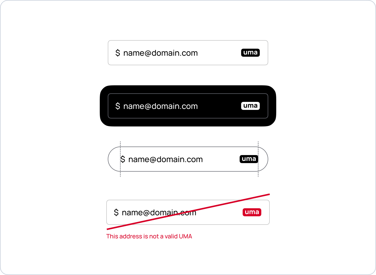
Don’t use or manipulate the UMA logo for any type of form validation. The logo only appears when an address is valid.
Alternate positions
The guidelines below cover displaying a Universal Money Address when positioning the UMA logo outside of a form field.
Position and scale
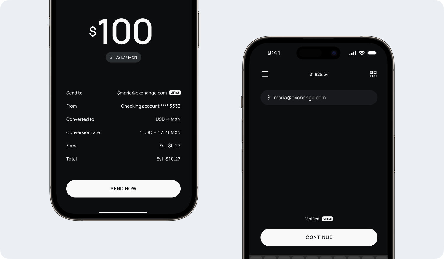
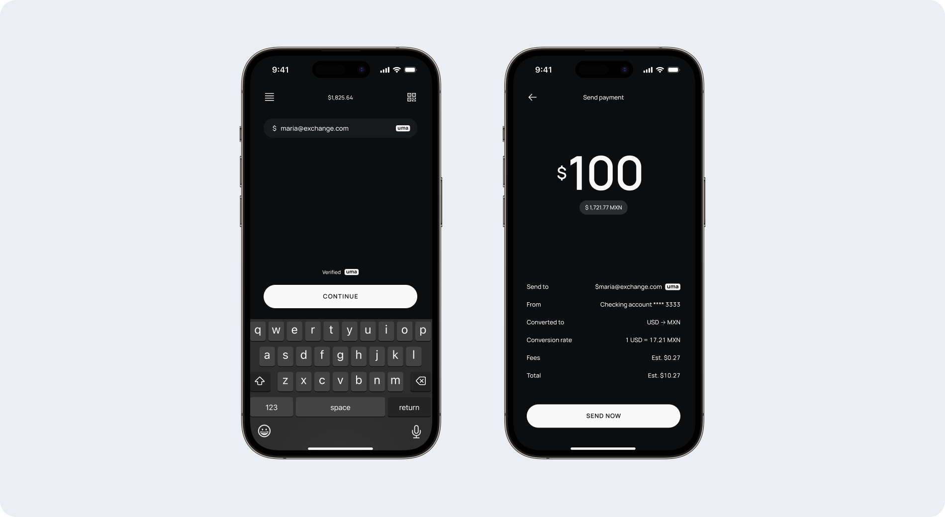
There may be instances where you want to closely associate the UMA logo with a address to make the complete address look like one element, or place it next to terms like “verified” to help build customers trust in an end-to-end flow. For example, you can add a context line alongside a primary call to action, or associate the logo with an address on a transaction confirmation screen. Here are a couple guidelines to consider.
- Again, it should be small, but legible enough to read. If it’s too big it can add unnecessary tension to the user experience.
- Use a high contrast color.
- Use the UMA logo sparingly. If the logo is repeatedly used on a screen it can lead to a poor user experience.
Examples
Here are a few screens illustrating proper use of the UMA logo. The aim is to make UMA feel at home in your product while maintaining some consistency across the ecosystem.
Questions?
We here to help with any questions you have about integrating UMA into your product. Contact us.